Embody
Moderator: Harukochan
-
yesterdayshero

- Posts: 315
- Joined: Fri Sep 07, 2007 6:26 pm
- Location: Passed out on your roof...
- Contact:
-
yesterdayshero
- Posts: 315
- Joined: Fri Sep 07, 2007 6:26 pm
- Location: Passed out on your roof...
- Contact:
-
RJFrazer
- Posts: 24
- Joined: Tue Feb 22, 2011 12:45 am
Re: Has anyone really been far even as decided
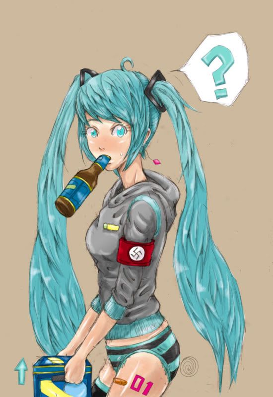
Achtung! Sieg Heil!
Meanwhile, Miku's manager puts his head in his hands and wonders just how many people he's going to have to bribe to keep the Vocaloids' secrets under wraps this time... ;)
Anyway, after looking through this thread I must say that I really admire your industriousness, yesterdayshero - you really keep up a prodigous rate of production.
-
yesterdayshero
- Posts: 315
- Joined: Fri Sep 07, 2007 6:26 pm
- Location: Passed out on your roof...
- Contact:
Re: Has anyone really been far even as decided
http://soundcloud.com/lacausa/funkin-shojo
Listen to this new song I made....
If I don't draw I'll die ala "Speed" lol, Vocaloid world domination isn't about music...you know...RJFrazer wrote:Achtung! Sieg Heil!
Meanwhile, Miku's manager puts his head in his hands and wonders just how many people he's going to have to bribe to keep the Vocaloids' secrets under wraps this time... ;)
Anyway, after looking through this thread I must say that I really admire your industriousness, yesterdayshero - you really keep up a prodigous rate of production.
-
yesterdayshero
- Posts: 315
- Joined: Fri Sep 07, 2007 6:26 pm
- Location: Passed out on your roof...
- Contact:
-
yesterdayshero
- Posts: 315
- Joined: Fri Sep 07, 2007 6:26 pm
- Location: Passed out on your roof...
- Contact:
Re: Has anyone really been far even as decided
PICTURE DELETED DUE TO ADULT CONTENT. DO NOT POST MORE LIKE IT IN THE FUTURE.
Two new songs from my music project "Lacausa"
http://soundcloud.com/lacausa/popipo-la ... olden-leek
Popipo (Lacausa Golden Leek Remix)
My first remix, it came out more Trance than what I would have wanted
~~~~
http://soundcloud.com/lacausa/hatsune-r ... at-hatsune
Hatsune Radio Feat. Hatsune Miku (no shit huh?)
A Disco improvsion I fixed up with samples made with Vocaloid 2 Miku doesn't really sing in it but her voice is ther ok?
I still very much suck at this producer stuff but I'm getting better take a listen if you have tyme...
-
yesterdayshero
- Posts: 315
- Joined: Fri Sep 07, 2007 6:26 pm
- Location: Passed out on your roof...
- Contact:
Re: Has anyone really been far even as decided
New song...
Orange Sky Feat.Hatsune Miku
http://soundcloud.com/lacausa/19s
An Electro improv with Hatsune-kun
-
yesterdayshero
- Posts: 315
- Joined: Fri Sep 07, 2007 6:26 pm
- Location: Passed out on your roof...
- Contact:
-
sarydactl
- Posts: 19
- Joined: Mon Apr 04, 2011 5:58 pm
Re: Has anyone really been far even as decided
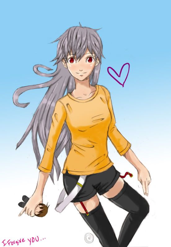
nevermind, i found this >:D . i like your panels with the swirly eye and " >_O (WHY MUST YOU DENY MY LOVE THAT'S SO PURE" the best~
your manga hands look like mittens tho; your illustrations show them a lot better >: . /i have no idea if critique is allowed in this thread lololol
your manga hands look like mittens tho; your illustrations show them a lot better >: . /i have no idea if critique is allowed in this thread lololol
-
yesterdayshero
- Posts: 315
- Joined: Fri Sep 07, 2007 6:26 pm
- Location: Passed out on your roof...
- Contact:
Re: Has anyone really been far even as decided
For the "chibi" style I just draw mitten hands, its faster lol crit away~
-
yesterdayshero
- Posts: 315
- Joined: Fri Sep 07, 2007 6:26 pm
- Location: Passed out on your roof...
- Contact:
-
shutupadrian

- Posts: 87
- Joined: Tue Apr 05, 2011 1:54 am
- Location: Alberta
- Contact:
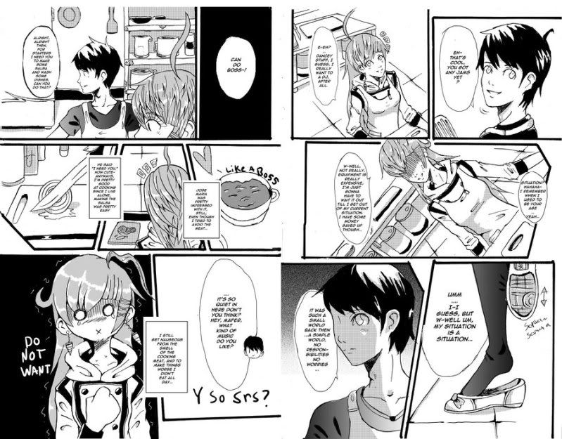
Re: The First of the Gang to Die
This is pretty solid work, actually. Not sure why you've scrapped it, but I'm sure your story is better for it. Also, critiquing something you've already scrapped is probably not that helpful to you, but I'll do it anyways. Sorry.
Full disclosure: I haven't read anything prior to these pages, so my apologies if there's anything I'm taking out of context.
And again, all this is just my opinion. I could always be wrong.
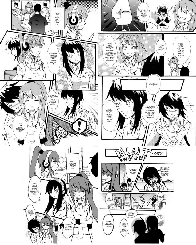
wolf_wolf_unused_001 (left side)
Panel 1:
Nice touch with the '?' and nice sense of light and shadow. I'd try using darker tones for the interiors seen through the windows, though. It should give the place a bit more depth.
Panel 2:
I realize it's a stylistic choice to not draw the eyes and mouths of your crowd, but they just come across as soulless zombies to me. If that's your intention, great! I wonder, however, if giving this panel an overall tone (maybe 10%) instead of leaving the whites would help pull the overlapping figure of your character a bit further into the foreground.
Panel 3:
Behind the figure - Sky, yes? Sunset? To be honest, a bit more rendering here might be helpful as I'm having trouble reading what that giant orb is.
Figure - I find her neck to be a bit long, but that just might be your stylistic choice. The highlights on her hair seem a bit scattered, with no real sense of where the light is coming from. Such dark shadows within the folds of her jacket as well, I wonder if some of that contrast should be carried up to her hair as well.
Panel 4:
Not entirely sure if this shot of her foot is entirely necessary in sequence. It don't think it really hurts, but it might simplify your layout by taking it out.
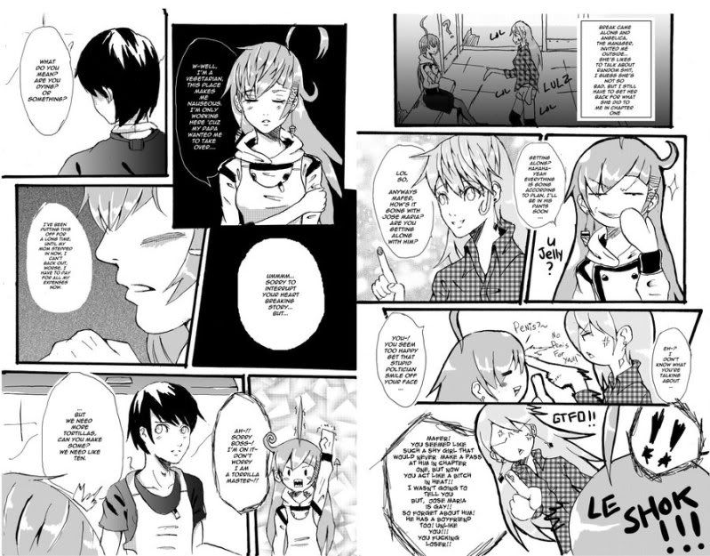
wolf_wolf_unused_001 (right side)
Panel 1:
Over the two pages, you have two profile shots of your character, and two dead-on full front shots. Maybe this shot (or the one in Panel 3) could be a 3/4? Add a bit of variety, I mean.
Panel 2:
/shrug. Is good. Well, perspective is a bit wonky, but that seems like another stylistic choice to me.
Panel 3:
Word balloon tail should be pointed more towards her mouth, unless she speaks out of her shoulder. Also, you might want to try avoiding italics in spoken dialogue unless it's meant to emphasize certain words.
Panel 4:
Is good.
Panel 5:
I'm not sure if it'd help by much, but I wonder about breaking up the one word balloon into two or three smaller balloons. Might reflect pauses (and breath) in speech a bit better.
-----------
I'll leave it at that.
Hopefully this helps even if just a little, and hopefully I'm making some sort of sense.
If nothing else, it gives me practice critiquing someone else's work. But that... ...that doesn't really help you, unfortunately.

Full disclosure: I haven't read anything prior to these pages, so my apologies if there's anything I'm taking out of context.
And again, all this is just my opinion. I could always be wrong.
wolf_wolf_unused_001 (left side)
Panel 1:
Nice touch with the '?' and nice sense of light and shadow. I'd try using darker tones for the interiors seen through the windows, though. It should give the place a bit more depth.
Panel 2:
I realize it's a stylistic choice to not draw the eyes and mouths of your crowd, but they just come across as soulless zombies to me. If that's your intention, great! I wonder, however, if giving this panel an overall tone (maybe 10%) instead of leaving the whites would help pull the overlapping figure of your character a bit further into the foreground.
Panel 3:
Behind the figure - Sky, yes? Sunset? To be honest, a bit more rendering here might be helpful as I'm having trouble reading what that giant orb is.
Figure - I find her neck to be a bit long, but that just might be your stylistic choice. The highlights on her hair seem a bit scattered, with no real sense of where the light is coming from. Such dark shadows within the folds of her jacket as well, I wonder if some of that contrast should be carried up to her hair as well.
Panel 4:
Not entirely sure if this shot of her foot is entirely necessary in sequence. It don't think it really hurts, but it might simplify your layout by taking it out.
wolf_wolf_unused_001 (right side)
Panel 1:
Over the two pages, you have two profile shots of your character, and two dead-on full front shots. Maybe this shot (or the one in Panel 3) could be a 3/4? Add a bit of variety, I mean.
Panel 2:
/shrug. Is good. Well, perspective is a bit wonky, but that seems like another stylistic choice to me.
Panel 3:
Word balloon tail should be pointed more towards her mouth, unless she speaks out of her shoulder. Also, you might want to try avoiding italics in spoken dialogue unless it's meant to emphasize certain words.
Panel 4:
Is good.
Panel 5:
I'm not sure if it'd help by much, but I wonder about breaking up the one word balloon into two or three smaller balloons. Might reflect pauses (and breath) in speech a bit better.
-----------
I'll leave it at that.
Hopefully this helps even if just a little, and hopefully I'm making some sort of sense.
If nothing else, it gives me practice critiquing someone else's work. But that... ...that doesn't really help you, unfortunately.
-
yesterdayshero
- Posts: 315
- Joined: Fri Sep 07, 2007 6:26 pm
- Location: Passed out on your roof...
- Contact:
Re: The First of the Gang to Die
Thanks~ I scrapped these pages because of story, I intended this story to be a 2 volume but, if I do manage to get a publisher interested, my best bet is a one-shot. Just in case it doesn't sell well at least people who liked the story have it complete. but after your critque I'm glad I scrapped them, I really need to work on backrounds, and anatomy. ugh, I wish I would have started drawing when I was younger, Thanks bro...shutupadrian wrote:This is pretty solid work, actually. Not sure why you've scrapped it, but I'm sure your story is better for it. Also, critiquing something you've already scrapped is probably not that helpful to you, but I'll do it anyways. Sorry.
Full disclosure: I haven't read anything prior to these pages, so my apologies if there's anything I'm taking out of context.
And again, all this is just my opinion. I could always be wrong.
wolf_wolf_unused_001 (left side)
Panel 1:
Nice touch with the '?' and nice sense of light and shadow. I'd try using darker tones for the interiors seen through the windows, though. It should give the place a bit more depth.
Panel 2:
I realize it's a stylistic choice to not draw the eyes and mouths of your crowd, but they just come across as soulless zombies to me. If that's your intention, great! I wonder, however, if giving this panel an overall tone (maybe 10%) instead of leaving the whites would help pull the overlapping figure of your character a bit further into the foreground.
Panel 3:
Behind the figure - Sky, yes? Sunset? To be honest, a bit more rendering here might be helpful as I'm having trouble reading what that giant orb is.
Figure - I find her neck to be a bit long, but that just might be your stylistic choice. The highlights on her hair seem a bit scattered, with no real sense of where the light is coming from. Such dark shadows within the folds of her jacket as well, I wonder if some of that contrast should be carried up to her hair as well.
Panel 4:
Not entirely sure if this shot of her foot is entirely necessary in sequence. It don't think it really hurts, but it might simplify your layout by taking it out.
wolf_wolf_unused_001 (right side)
Panel 1:
Over the two pages, you have two profile shots of your character, and two dead-on full front shots. Maybe this shot (or the one in Panel 3) could be a 3/4? Add a bit of variety, I mean.
Panel 2:
/shrug. Is good. Well, perspective is a bit wonky, but that seems like another stylistic choice to me.
Panel 3:
Word balloon tail should be pointed more towards her mouth, unless she speaks out of her shoulder. Also, you might want to try avoiding italics in spoken dialogue unless it's meant to emphasize certain words.
Panel 4:
Is good.
Panel 5:
I'm not sure if it'd help by much, but I wonder about breaking up the one word balloon into two or three smaller balloons. Might reflect pauses (and breath) in speech a bit better.
-----------
I'll leave it at that.
Hopefully this helps even if just a little, and hopefully I'm making some sort of sense.
If nothing else, it gives me practice critiquing someone else's work. But that... ...that doesn't really help you, unfortunately.
-
yesterdayshero
- Posts: 315
- Joined: Fri Sep 07, 2007 6:26 pm
- Location: Passed out on your roof...
- Contact:
-
StrateryB
- Posts: 293
- Joined: Fri May 09, 2008 9:13 pm
- Location: Stealing someone's glasses
- Contact:
Re: The First of the Gang to Die
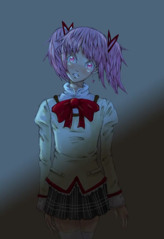
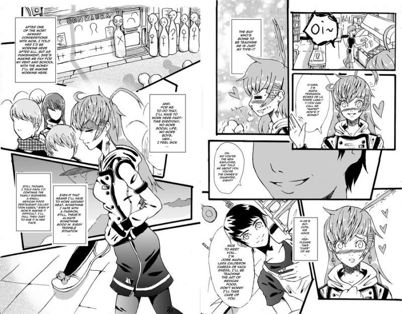
Ooh, I like her face. Very cute expression.
though I feel somewhat guilty for saying that since she's questioning the forbidden zone...lol
though I feel somewhat guilty for saying that since she's questioning the forbidden zone...lol